After one day in Cajobí, I’m afraid I’ll never be able to pronounce “diabetes” like an American ever again. We came to Cajobí via cozy Chevy, taking in 45 minutes of rolling sugar cane fields along the way. Raw sugar is among Brazil’s top exports, but a sizable amount of it stays right here in São Paulo state. In texts to my mother, I’ve described Brazil as a real life candy land, where delicious cakes, amazing fried creations with salty, creamy centers, and endless other treats seem to be within reach for little or no cost more often than not. It’s a college student’s paradise, but the 12 million Brazilians with diabetes can’t enjoy it like I can.
Improving patient education is a big part of what the AME (the outpatient secondary care unit of Barretos) does, but with so many patients to reach, AME needs help from local primary care physicians. AME’s approach? D-Days. If that sounds intense, good. An AME D-Day is a day devoted to one health issue, like hypertension or diabetes. On a D-Day, specialists from Barretos travel to a clinic in one of the 18 cities that feeds patients into the Barretos system, only admitting patients who share the same illness, most of whom have been on an appointment waiting list for at least a year. One of the problems being combatted on a D-Day is the unnecessary amount of referrals to AME. This clogs the waiting rooms and prevents AME from treating patients with the greatest needs, so AME specialists also take D-Days to train primary care physicians to better identify which patients need secondary care.* While the specialists train local physicians, using each patient as a learning experience, other AME staff works to improve education in the waiting room. Here I got to see the Rice 360˚ Diabetic Foot and Retinopathy Glasses put to use, making me not only proud of my school, but more aware of how my hypertension education project will be used.
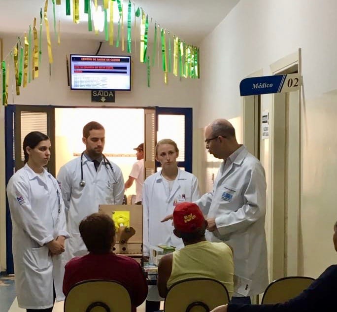
Dr. Guilherme walking patients through the Rice 360˚ diabetic foot.
My project so far has two parts, one to be used exclusively on a D-Day, and the other to be taken home and used daily by hypertensive patients. The D-Day only side of the project is modeled similarly to a poster Barretos had designed to help AME staff explain diabetes to patients with no formal education. I noticed at Cajobí that I didn’t see this poster in use, as the staff had interactive models that were probably more effective. I’ve discussed with the AME staff ideas for making a model similar to the diabetic foot, but for hypertension, but I will not have time to conduct the project here, and I am referring it to Rice 360˚. The hypertensive model is more challenging to conceptualize because there is no equivalent to the diabetic foot in hypertension. Consequences of hypertension are largely within the body, and cannot be shown with the same force as a foot that loses a toe or has a painful infection. Visually, hypertension can be out of sight, out of mind, excepting the far less dramatic skin redness, and the retinopathy for which a physical model already exists. For these reasons, we have decided to focus the poster on hypertension reversal and the consequences of neglecting the disease. The poster will be used by a staff member who casually presents to a small audience of hypertensive patients in a waiting room.
These challenges make me the most excited for my home-use design. I’ve been making a zero word, zero number daily diet tracker for the patient who is hypertensive and illiterate. It is modeled after the DASH diet with some culturally based tweaking by my friends at AME.** So far, the design uses a grid like system, inspired by advice from the LinkedIn article mentioned in my last post. On one axis are pictures of foods, grouped by type, and on the other are pull down tabs used to track the amount of each food group eaten that day. The tabs are divided into units that display portion size related to parts of a hand and are color coded with red, yellow, and green to display when to slow down and stop eating that food group for the day.*** Self consciously, I’m posting the take home design early on in the process. (I would like to show the poster sketch as well, but it is currently covered in hand written, Portuguese notes from my AME friends. Next time.) With only a month left to work and no guarantee for usability testing, informal feedback will be extremely helpful, so please be welcomed to email with your thoughts and questions!

PowerPoint version of the grid with all tabs pulled down. Physical model is about 8in x 7in.
———————————————————————————————————————————
* We’ve made two friends from the University of Miami’s Sylvester Medical School who are both MPH/MD candidates. For a capstone project, one of them will conduct a statistical study investigating the health of those not referred to secondary care during the D-Days.
**The “culturally based tweaking” is really important. Understanding how portion size is perceived in Brazil has shaped my design dramatically. Before including portion size information, my design told users they could have 6-8 servings of whole grains a day, without using any words. An AME staff member told me that if I don’t find a way to show users who are illiterate what one portion of whole grains means, users will eat 6-8 6-inch loafs of bread a day. Yikes.
***I’ve been assured that users with low literacy will be familiar with the red, yellow, and green symbolism, but I’d like to collect some user feedback. Stay tuned.