Boa tarde!
Amidst the time-consuming and meticulous task that is modifying an existing Android mobile application while learning the coding language at the same time, I have also been keen on taking creative breaks. And by that I mean, working on redesigning the user interface, or UI, of the Melacap app.
As I mentioned in my previous post, Dr. Carlos expressed concern that some of the users would not be motivated to adopt the app if it were not inviting and easy-to-use. That was exactly the cue that I was waiting for to get started on redesigning. I must admit, ever since I first started working on it, I had been itching to work on that aspect. Even though the Melacap system is meant to help the diagnosis of cancer, if it is confusing and hard to use, it will also hinder its effectiveness. As a graphic designer in engineering, this is often a discussion I have had with other peers.
But this time I was explicitly asked to do it!
Here are some of the updated screens. The main idea behind the updates was to make it not only more aesthetically pleasing, but also create a more clear user path to be able to access the important functions.
FYI: The app used to be called UVFree. Johan, one of the original team members, Megh, and I decided to update the name to fit its purpose more effectively.
Comparison of loading screens
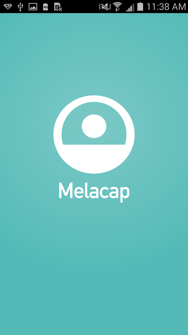
The main goal here was to add a new loading screen to reflect the name change and color scheme.
Comparison of login screens

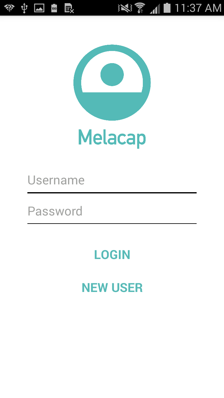
Similarly, I didn’t make any radical changes here. Once again, the logo and colors were updated, in addition to having the text “username” and “password” disappear as the user enters the information. Lastly, the “LOGIN” and “NEW USER” button reflect the floating button style to create a more modern look.
Comparison of home screens
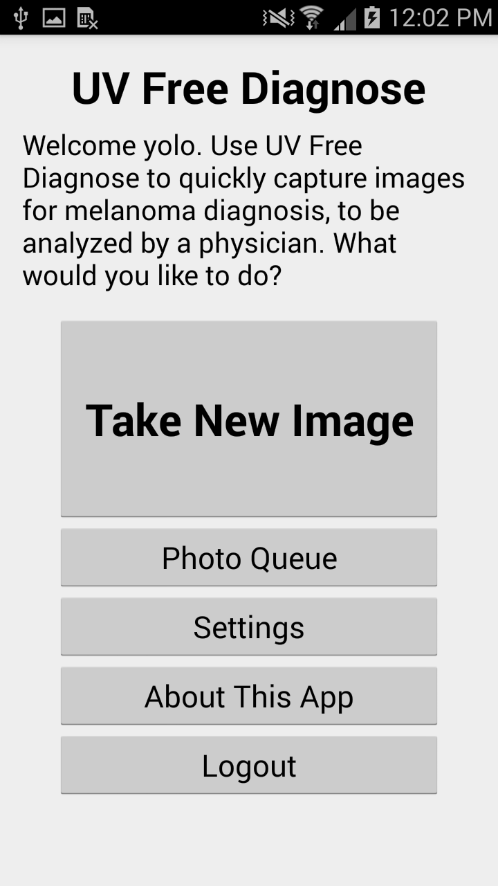
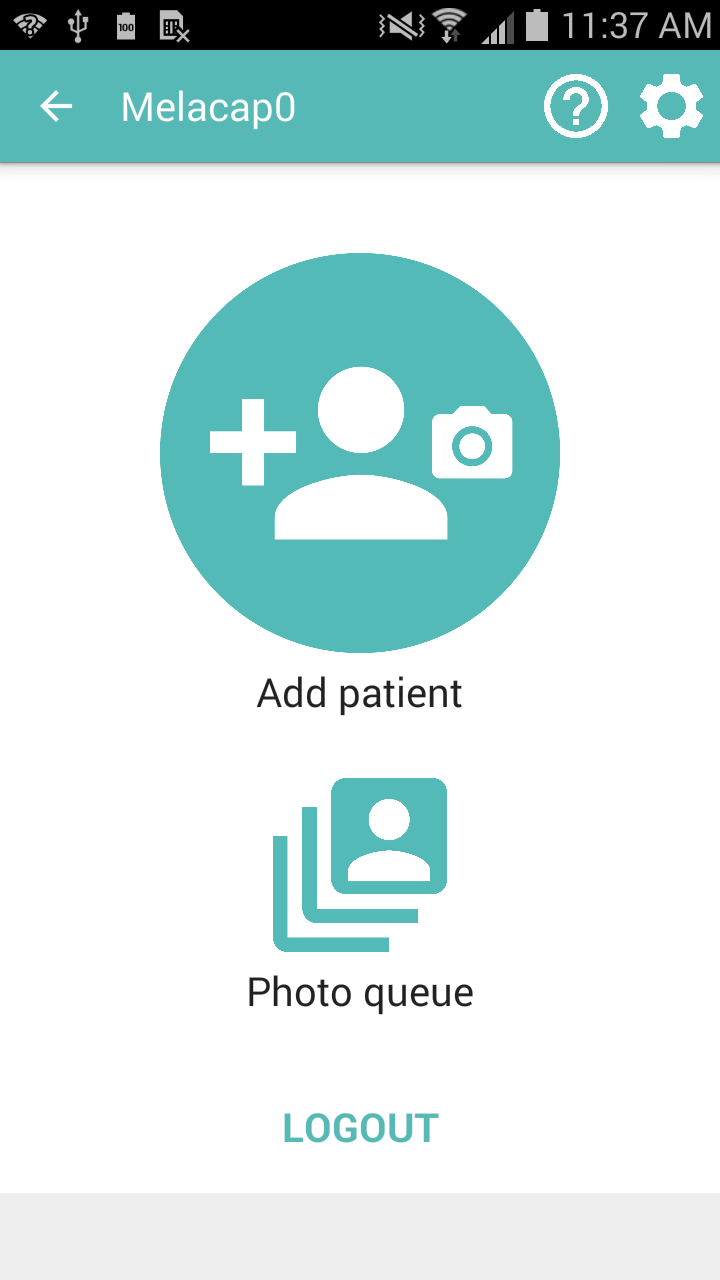
Here I introduced some drastic changes.
First, I eliminated the welcome text — my goal is to make the UI clear enough to where instructions are not expressly needed, but can be accessed via a help feature or instruction manual. The text also clutters the interface, making it harder to find what you want.
Second, I rearranged the buttons, adding icons to try and give visual cues. In my opinion, “Take new image” was misleading, and I modified that to “Add patient,” since it also involves filling out their information more so than simply taking an image. That button I made most prominent (maybe a little too prominent), but it is by far the main function that will be accessed. “Photo queue” I also modified with an icon and left it at the bottom to be easily accessed. “About the app” and “Settings” I placed on the Action Bar on top, with the “?” and typical “Settings” gear, as these functions are accessed less frequently and do not require as much space in the main interface area.
Third, I updated all of the colors and the “LOGOUT” button to fit the set color palette and design style.
Comparison of patient information screens
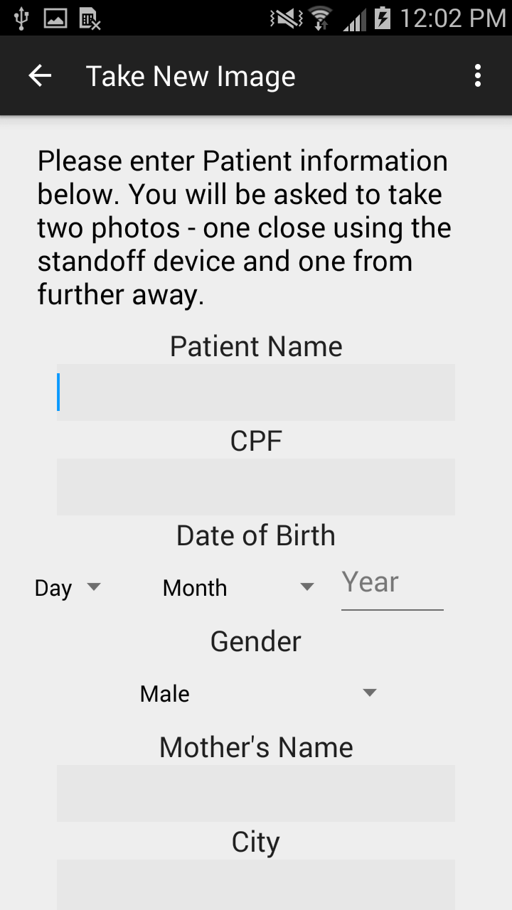
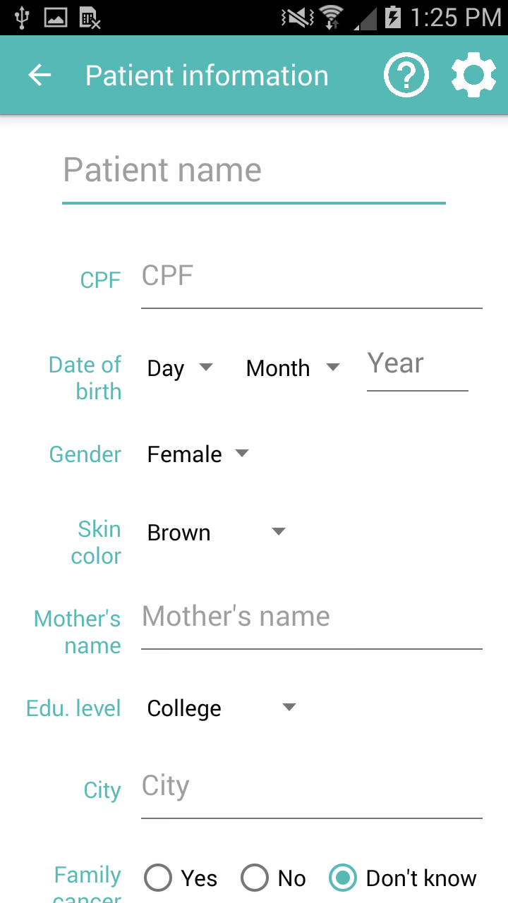
Here I kept the same structure, but rearranged the layout and updated the color schemes. The main motivation behind this was to keep the field label on the left to be easily read, and the input area on the right to systematically scroll down and fill it out. The “Patient name” is also prominently on top to help indicate that this information all pertains to the patient.
I still have a lot more screens to update, but hopefully it looks like an improvement! I’m still learning more of the development and coding so that has been more of a struggle. But the excitement we have received from the people here for this app makes it really worthwhile — almost everyone we have talked to has been really interested in using it in some way and have gotten inspired thinking of more ideas.
And as I keep mentioning, I have always wanted to work on app development, and particularly in the user interface design. The fact that I can work on this so close to the some of the end users is an asset — I can walk down to Dr. Carlos’ office, and ask him his thoughts, and as I develop more I’ll be able to also ask some nurses that I have met on what they think. For a graphic designer / engineer, this is nothing less than an awesome space on which to develop meaningful technologies.
Will be updating as I can — adeus!